Pages
Stay In Touch
More
© 2026 The Somerville Times. All rights reserved.

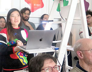
Type designer June Shin of Occupant Fonts spoke at the Katherine Small Gallery on February 28.
By Shira Laucharoen
What does it mean to be an occupant? This is the question that Cyrus Highsmith, type designer of Occupant Fonts, poses. Occupant is an open-ended word, he says. To be an occupant, one must be present and open-minded. It implies a temporary stay, but the place of occupancy can be “as much of a home as a permanent one,” he states. “Typefaces occupy, engage, and express within spaces often structured by others.”
The designers behind Occupant Fonts traveled from Providence, Rhode Island to speak at the Katherine Small Art Gallery in Somerville on February 28. Guest speakers Highsmith, June Shin, Cem Eskinazi, and Marie Otsuka presented a talk, “Occupied,” outlining their work in typography. The event was the twelfth Standing-Room Only Lecture to be held at the intimate space. The artists described new innovations in their field, unique features of their website, and what they do when they have reclaimed time for work or pleasure.
During the talk, Otsuka demonstrated how a tool, “Edit Mode,” enables users to “occupy” the website as well. By activating Edit Mode, a user becomes a tenant of any page, given the ability to test out font combinations, reset the typeface, and modify content. Toying with the site’s letterforms, anyone is free to explore a point of view, by simply toggling a switch. Eskinazi spoke to the process of kerning, the adjusting of spacing between characters, which he had previously labored over manually.
The current development of the informally dubbed Machine Learning Kerning (MILK) program, which will allow for kerning assisted by a computer algorithm, will liberate font designers, giving the team at Occupant Fonts more time to pursue other activities. Shin explained how they often visit graveyards or libraries to draw inspiration from the letterings found there. In addition, they frequently go bowling or ice-skating, she said.
While every type designer has a different process for creating fonts, the style and appearance of the font can tell a story, suggest a personality, or convey a message, said Highsmith. For example, The Boston Globe’s headline uses the Miller serif typeface, which has an “old fashioned, wing tipped, business like feel,” recalling the “flavor of Boston,” said Highsmith. The style of a font carries meaning, which it can bring to the larger project that it is a part of, he said.
“A font is one detail in a pretty complicated presentation,” said Highsmith. “If you think about a book, for example, there’s the typeface that it’s set in, there’s the paper, there’s the margins, there’s the cover, there’s a lot of stuff that goes into making the impression of that document. The typeface can represent the voice of the publisher, the author, or character. It can be evocative of the time and place that the book might be set in. It’s one detail that can support a bigger presentation.”
Curator of the Katherine Small Gallery, Michael Russem, conceived of the gallery in 2018, bringing to light artifacts of graphic design and typography, as well as printed ephemera. He said that the typefaces he is drawn to might gesture at a meaning simply, without indicating it overtly.
“They should reveal something about the task at hand,” said Russem. “The best designs, for me, are subtle. The typefaces stay out of the way but might hint at something. Ideally someone should just be reading the book or reading anything, not paying attention to the typeface.”
Shin said that the role a font plays in the creation of a project is part of artistic expression. The choice of lettering brings highlights to what we see, she said.
“What tone is to speech is what typeface is to writing,” said Shin. “It colors what you say, like intonation.”


Reader Comments